Visual update on how my baptismal font finally turned out

Skärmdump 2014-11-05 18.28.35 Skärmdump 2014-11-05 18.29.00 Skärmdump 2014-11-05 18.29.25 Skärmdump 2014-11-05 18.29.42 Skärmdump 2014-11-05 18.32.35

So this is how I made the new version of the baptismal font. I decided to go all out on the skyrim theme and modified reality, so I painted my own relief on the font using the same style as those on the original font from the museum. I also decided to change the material from the light chalk stone to a darker shade stone, Because I felt that I could make the diffuse map more interesting that way in terms of color shifts.  I wanted the font to look old and well used but not ruined. I have corrected my mistakes from the last model according to the feedback as far as I can see, so hopefully this will land me a passing grade. thank’s for reading!

Week 8 3D1

This week’s post will focus on “photogrammetry” or the use of scanning objects using photos and turning it in to 3D objects. During class this week we were given the assignment to create a 3D mesh on top of a facial scan, the idea was to use a scan of our own faces. However the scan of my face was somewhat incomplete and lacked sufficient coverage for me to be able to patch together a model. I wish now that I had made a few screenshots of those incomplete models, because it looked really scary and deformed. So I ended up using the photo scan of a former student’s face that the teacher provided instead of my own face.

highlights highlights1 highlights3

The main topology of the face is based around the mouth and eyes, with loops supporting the massive deformation that those parts of the face are capable of performing. The topology here is based on just that, which parts that move the most and which are more rigid. So looking at the anatomy of the face can be very helpful when designing the edge-flow for a face mesh.

It is really cool to work with a foundation that is as accurate as the scan is, where you are able to lift the exact proportions and unique features right off a face and into your mesh. It feels like this should be the future of game graphics, at least as a measure towards giving characters unique and believable faces.

I read the article on Photogrammetry at ‘Photogrammetry’ in ‘The Vanishing of Ethan Carter’ and was really impressed by the way they used the photo scans as a base for their specific art style. I also really liked how it discussed the visual complexity of nature and the difficulty of capturing that in game graphics. For me that complexity is to a high degree an issue of time restriction, I pay a lot of attention to the complex details that make up the whole impression of an object. But I often find it hard to justify the work hours needed to achieve those results against the timeframe of a game project, the fact that the time limit for the games we make at school is usually around eight weeks could factor in to this reasoning of mine…

The main potential with photogrammetry as I see it is to use the scans to provide the complexity of reality as a base and then use the artist’s own expression as an extension on top of that. That way you will have created an optimized version of modified reality, as the subconscious will probably buy the illusion of nature-made complexity in a setting that is completely spaced out and fictional. It is interesting that they mostly used this method as a way to break and rebuild the way they viewed reality, because that is the process that many artist go through in order to form new ways of expressing themselves through image distortion and abstract art styles. You have to understand the pieces that makes out the impression of an object before you can distort it, or make an abstract version of it.


Assignment 3: visual update 3


Skärmdump 2014-10-29 22.05.49 Skärmdump 2014-10-29 22.06.11 Skärmdump 2014-10-29 22.06.24 Skärmdump 2014-10-29 22.10.52 Skärmdump 2014-10-29 22.11.03 Skärmdump 2014-10-29 22.12.01 Skärmdump 2014-10-29 22.05.27


This is my murloc imported into UDK, complete with normal, specular and diffuse map. The only thing missing is the alpha texture I made for the teeth! because I have not yet figured out how to include it in the package, so for now the murloc is looking kind of sweet and cheerful… which is not an accurate way for a murloc to be perceived.  Even so it still feels like a personal victory and a milestone to see my first 3D character complete and in-engine! I am still going to make some changes and tweak a few things here and there depending on the feedback a get from the teacher. 


Week 7

So for this week’s post we are to self-evaluate our own knowledge of anatomy artistically speaking, so I will show a few of my 2D drawings and share some of the feedback that I got from my fellow students. Some of these images are already shown in previous posts, so “sorry” or “your welcome” if someone has to repeat the experience.

stone golem turnaround stone golem nils_wennergren_turnaround1 Wildlife nils_wennergren_lineart nils_wennergren_rough jättensomhadetråkigt julkort_nilsdwarf_of_the_day

The thing that I received the most critique for and that I myself also think is the area I could use the most improvement is when it comes to motion in my images. There are a lot of static lines and a lack of general movement in the poses of the characters. Another thing is that I seem very inclined to mess with the proportions of most characters, like having everything stretched out and elongated, which could be used as a style characteristic but if so I should do so with a clear pretense of doing just that.

One major gap in my work with characters right now is that I haven’t made a lot of female subjects, I think that I’m just more comfortable with drawing the male body and anatomy. Which is in fact kind of strange considering that almost all of the nude models I have drawn from in class since I began studying art has been women.

When I now realize some of the knowledge gaps that I have, I will try to fill them with focusing my drawing exercise towards those subjects. Firstly I will focus more on practicing action-pose drawing, and the way I thought I should do that is to do five minute sketches were I pick different verbs or expressions to illustrate. Just to squeeze in as many of those exercises as I possibly can whenever I have a spare moment, which is not very often these days but I’ll try.

I will also start to use more anatomically correct reference- images when I draw characters in general just to burn those proportions deep into my standard procedure of construction drawings. Also I really should get over the bump and start drawing more female characters and really get into it so that I become comfortable with that, because that is something I need in order to become a versatile artist. But I really think that it is just a matter of routine and practice, I just need more hours to grind and play with it to get where I need to be and I really try to draw a lot and do concept art in 2D just for practice and fun. I really try hard to not forget that drawing is really fun and something I just love doing just for the kick of expressing my imagination and create my own little worlds full of my images.

As bonus material I will now show a sneak peek of my latest concept work! It is just a practice image drawn from imagination in my spare time, but I did play around with the pose a lot to get the expression that I was looking for. It has some way to go before it is finished, but you can perhaps see the direction it is going in, and I welcome all tips and critique I can get towards completing it! I live to learn.

jätte som inte är färdig

Assignment 3: Part 1

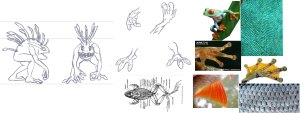
So the following is what I received from Björn in terms of character background and instructions along with some image references.

murloc reference

Name

Y’hrel

Nickname

Dryskin, Air Dweller

Gender

Male

Age

Young Adult

Physical Characteristics

Not as shiny as his fellow kinsmen, due to his body having learned to conserve moisture to a greater extent as he’s made his way on land.

Movement

As a Murloc, few things could match him under water. More than capable of hunting down schools of fish armed with little more than a net or spear. On land his balance is somewhat off, forced to plod forward as his weight becomes more of an issue. This does not mean that he lacks agility however. Combined with his relatively small size, he is more than capable of keeping up a sprint faster than most humans. With practice of course.

Diet

Mainly fish and smaller amphibians, although he has learned the nutritional value of various things further inland such as insects, rodents and other critters as well as some vegetation (he’s fond of apples in particular).

Intelligence

More or less capable of abstract thinking and social reading much like humans. However he does have different priorities from mammals. While having acquired a more omnivorous diet he is still very much a predator, more willing to chase something down than having to conduct tedious endeavours such as digging and climbing to get a hold of roots or fruits.

Culture

Y’hrel’s tribe is for all intents and purposes hunter-gatherers, as they’ve lived for countless generations. While they do have certain traditions, nothing is set in stone. More keen on a practical mindset, as circumstances require them to shift their schedules more than once. A Killer Whale might disrupt their hunting routine, yet it is not something to be faced. You have a better chance of survival by keeping low and waiting for the danger to pass.

History

Hatched and raised on the coast of the northern wetlands, Y’hrel was always considered the odd one among his tribesmen. Rather than spending his time honing his diving or heading out to find precious clams and other valuables out at sea, Y’hrel’s restless feet often lead him further inland. To the arid hills and plains where the bizarre dry-skins dwelled who abhorred water in any form. His curiosity often getting the better of him, the young Murloc journeyed deeper into the woods and highlands each day much to his kin’s dismay. Yet through either sheer luck or resilience he managed to survive this alien world and began learning of it. While reluctant at first, his tribe eventually allowed him to continue his ventures as they recognised the various items and oddities he managed to bring with him. Despite his accomplishments he was always treated as the oddball, borderline stranger at times.

His folly, as it would turn out, would prove to be his saving grace.

Without warning, massive scaled creatures emerged from the deep, creatures that Y’hrel thought were just stories: The Serpent Men. Towering over the Murloc huts armed with tridents and nets. Whoever resisted was slain, the rest were bound and dragged back into the dark depths. None were spared except for Y’hrel, who had been away collecting various plants. When he returned he witnessed the last of his tribe being led into the water. Whatever madness gripped him at that moment is unknown, as he rushed towards his captured kin and freeing them before the giant serpents could react, urging them to follow him into the woods. Most of them succeeded, the Serpent Men unwilling to chase after a mere handful of survivors. Their apathy was not unfounded: No one survived the Drylands.

Now together with the remnants of his tribe, Y’hrel is forced to take up the mantle of leadership as he seeks to guide his kin through the unknown forests where your fins cannot help you in hopes of finding a new home, should they survive.

concept

My thoughts on the character

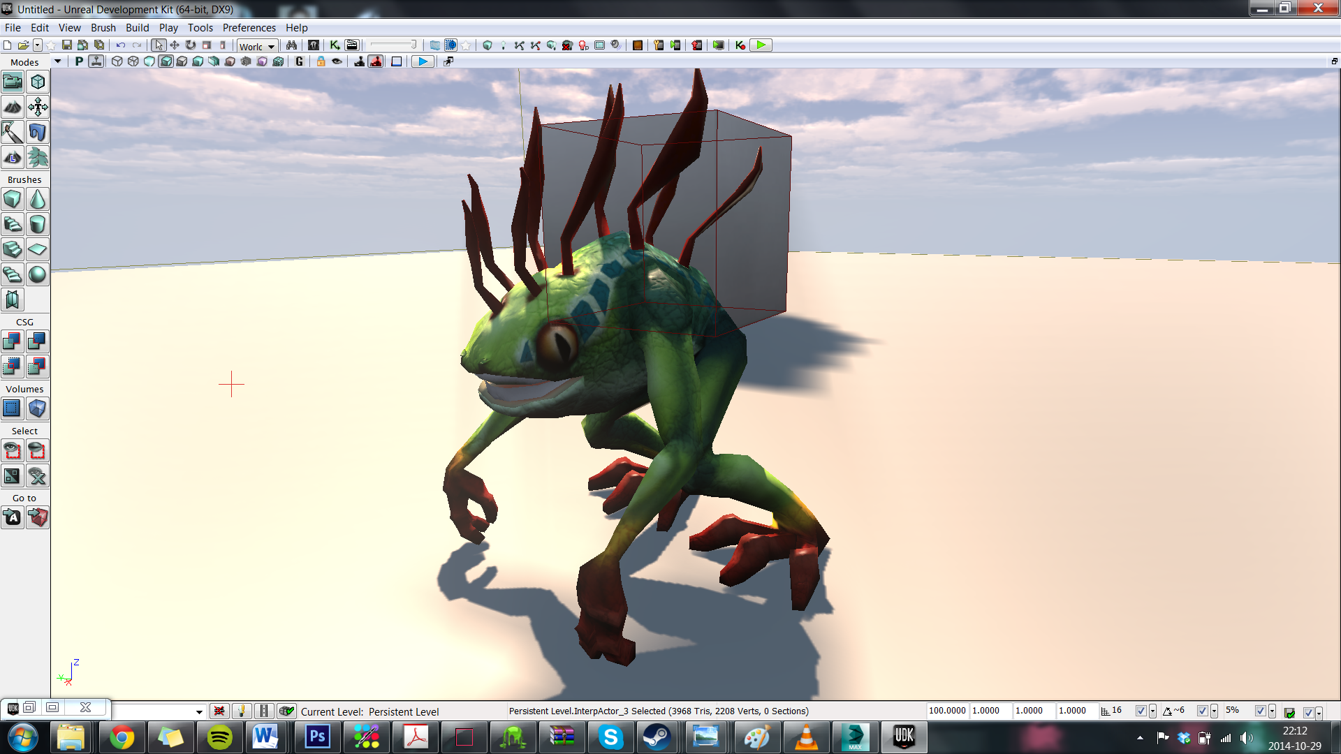
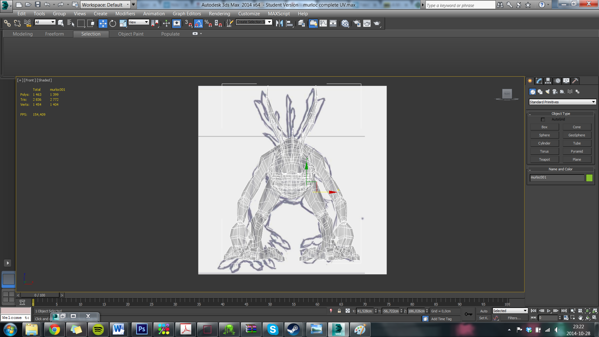
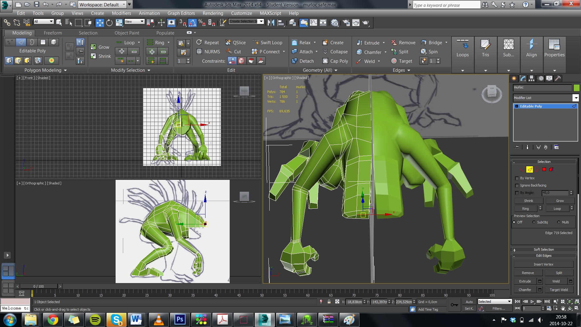
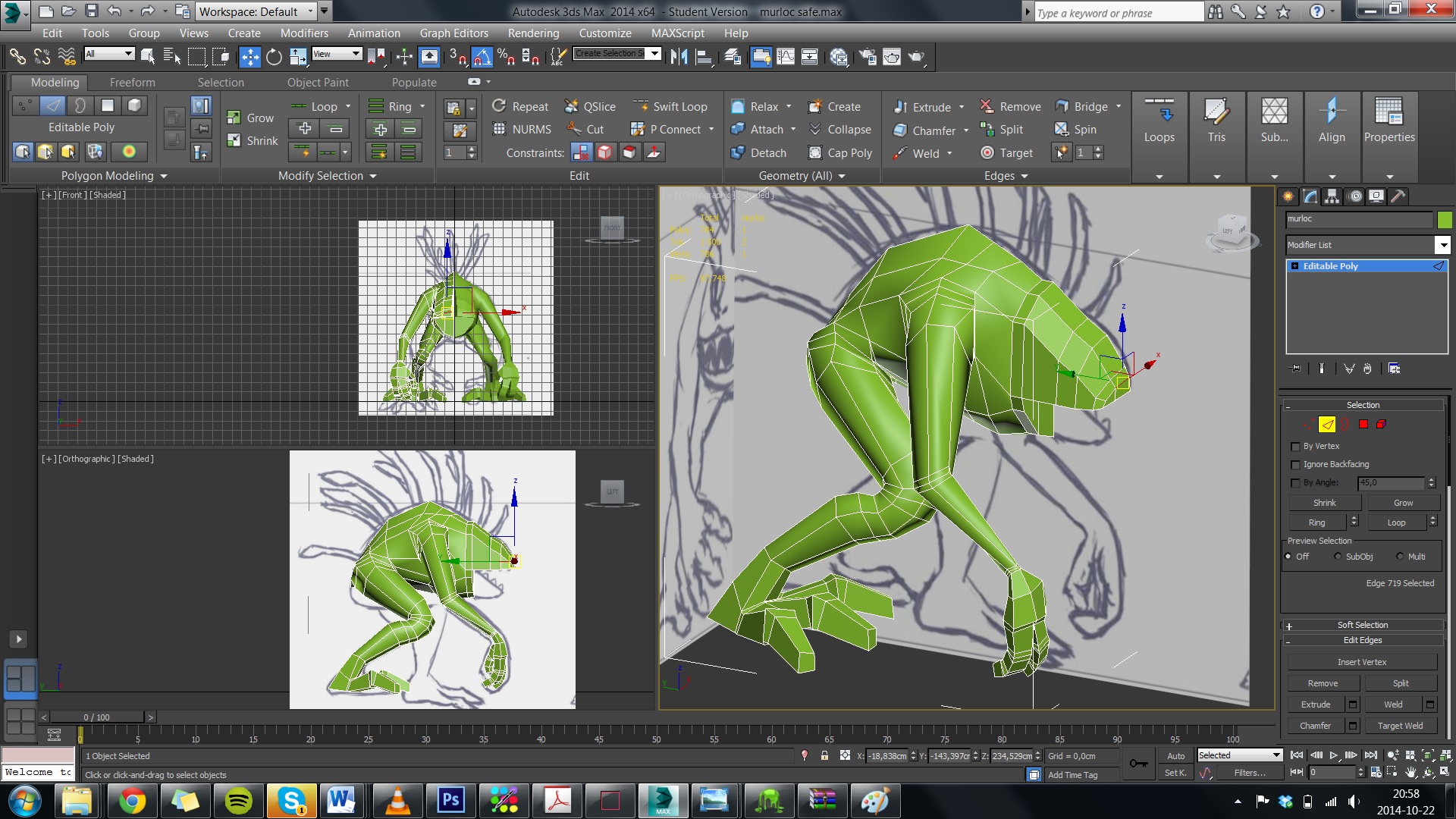
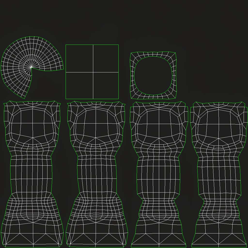
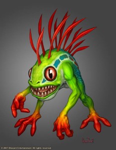
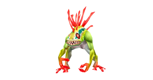
I think that I have a lot of background to work with and I have got a lot of inspiring ideas on how to shape Y’hrel based on his background and experiences. Technically speaking it is somewhat reassuring to know that this character or “species” has already been made in 3D by blizzard and I can look at how they modelled to get some direction if I should get lost.

World_of_Warcraft-306424398

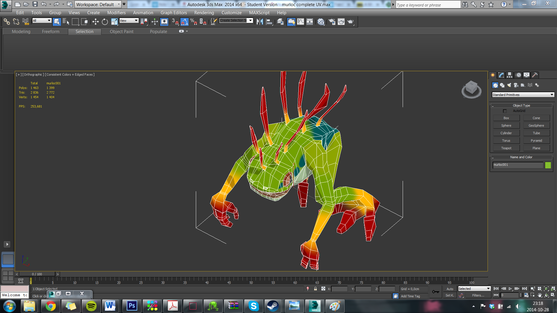
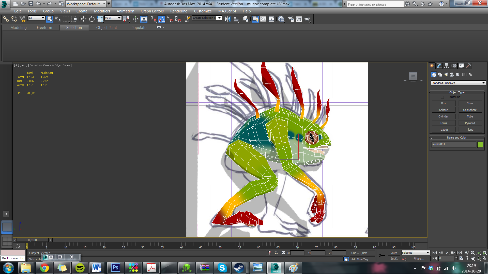
What I need to know from Björn about the character is just how specific he is regarding the color scheme and texture, and how much I can add on my own accord by interpreting the backstory. Also I need help with determining the best way to go about doing all the little details like teeth and the sprouts that are on the creatures back, like if I should do them as planes with texture or if they need full volume.

The biggest risk for me is that I make bad decisions early on and then just build a great big sand castle on top of that, which will later crash in my face and make it a resort where people fall asleep in the sun and get cancer. So to prevent that I will try to get as much input as possible from people with more experience than me early on.

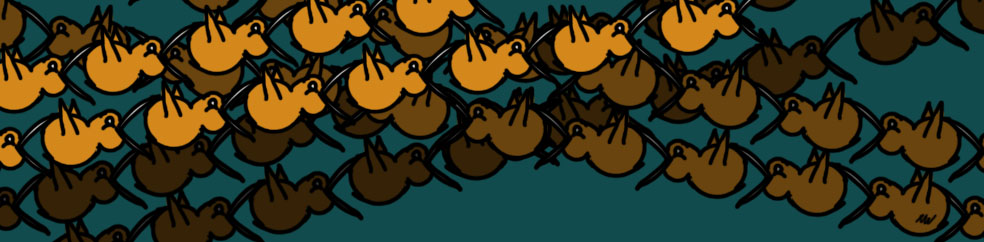
As far as visual style goes, Björn has not given me more than the reference images to go on, so I will have to ask him about it. But I assume he wanted me to go for the style that the murlocs are created in by blizzard.

Assignment 2 presentation and progress report


DSC_0181 DSC_0180

Here is the presentation and the progress report of assignment 2 all baked in to one. I chose to model a 12th century baptismal font. At least I thought it was a baptismal font during the entire process of making it, only to find out after some further research that it is in fact a “Piscina”! the Piscina is a drain used by the church to dispose of holy water and to wash the communion vessels, usually they are connected with the foundation of the church so that the water is disposed on holy ground. This particular pascina was made by master of stone work Hegvald, Sjonhem church in the first half of the 12th century.

My mistake was to associate the object with the other baptismal fonts as a themed section of the museum! So my model is a font with piscima influences and resembles more the design of baptismal fonts made during the late part of the medieval era than the ones in the 12th century, as those were made big enough for a whole baby to be bathed in.

The visual style I was going for was that of games like skyrim, I wanted modified reality. In the case of skyrim it is hardly even modified reality but rather trying to capture the culture and time period that the font or piscimal portraits as it is. Keeping in mind that the object would not be quite so old as It is now in a skyrim like setting, I kept the silhouette intact and restored parts of the patterns that were destroyed.

The biggest risk with using this object in the setting is that it is an object directly linked to a religious practice that is one of the largest in the world, so I do not want the symbolic of the piece to too specific as far as religious meaning is concerned. But I think that the context of the symbols on this font are not relevant enough for modern people today, and the symbols are vague enough to be inserted in to a constructed spiritual setting in a game. There are no visible crosses and the people depicted in the reliefs are portrayed in a way that is quite universal for medieval folk.

The positive factor that is enforced by using a religious item is that it can be used to create associations to spiritual proceedings and rituals, that in a fictional setting will lend some credibility and easy the players immersion in the game world.

flow dopfunt

I was perhaps not as thorough as I should have been when making this edge flow, but this was to the first iteration that I made, in that one I made the font in separate pieces. A bad idea I was later told by someone with more experience than me.  

When modelling I was at first quite worried about the complicated relief of shapes and patterns on the object, but in the end I decided that the vital part that I should focus my poly count towards was the silhouette. After talking to people with knowledge of baptismal fonts of the era, I gathered that the most important decorations were placed on the head of the font, so I decided to work by that same rule and make the most actual in-model made details on the head of the font and create the rest with normal map.

vinkel 1 vinkel 4 bitmap


assignment2_textures_spec assignment2_textures Assignment2_Baptismalfont_N

The framework on the specular map is from before I completely optimized the poly count of the model. I could still use the same maps. 

I have spent a lot of hours on iterating this model! And even more on iterating the uv maps! It has been really frustrating but at the same time extremely useful in educating me in the process of modelling and texturing. I also got to put my photoshop experience to good use once more, which was nice because it gave me somewhat of a confidence boost that I had some pre-existing knowledge of use.

in engine1 in engine

Week 5

sci fi 2 sci fi 1 rendered crate

So here is my final result for assignment 1 complete with normal, diffuse color and specular maps. In these images the crate is only rendered in 3ds max locally. I have made a few minor changes from the crate I handed in since it was not approved as it was then. I have optimized the poly count further and I have also tweaked around with the diffuse color and specular maps, and I think it all works just a bit better now that the changes have been made.

The functions of the three maps are the following:

new scifi crate norm

Normal map is used to create the illusion of depth and shapes that are limited to superficial layers, by reading the range from light to dark value in a texture, light will stand out and dark will stand inwards. The effect cannot break the actual silhouette of the model but still it manages to create very convincing illusions of sculpted shapes. The strength of normal maps is just that; a way to create complicated shapes and patterns without paying a polygon-heavy price.

Often the normal map is created on top of a very high poly model, to then be applied to a low poly model of that same object. Still lacking experience with 3D I can sometimes have a hard time making the proper judgments regarding when to use only the effect of normal mapping and when to actually use the extra polygons to create shapes. However the more I try it out and ask the teacher, it always comes down to how the silhouette is affected by the decision, if the silhouette is correct according to the shape you’re going for then you can use normal map for the details.

new scifi crate diff


Diffuse color map: In this texture map all the actual colors are applied in their neutral opacity and saturation without regard to any shading or light. It can be a good idea to go back and forth between photoshop and max and perhaps even your engine to see how the colors are rendered in the final states, I have found that it sometimes varies from program to program and in combination with the specular map.

new scifi crate spec

Specular map: In this map you decide the reflective capabilities of the different surfaces on your model, like if there are parts that are supposed to be shiny and parts that are matted. As with the normal map this one is also constructed with only values of light and dark, making an area dark will give a matted surface in the final render and making it light will produce the opposite.

What makes these maps so important is the factor of recognition and visual literacy when it comes to the human eye’s ability to identify objects in a surrounding, the variations in specular levels will help the viewer/player to differentiate between a wide range of materials that would otherwise be a mess. For example what part of a character is clothes, armor and what is skin, or what parts are ice and what are snow in a level design.

That will be all for week five! thank you for reading!

Character Background Jorm


stone golem

Name: Jorm. It has no name that can be pronounced by humans, through folklore since the dawn of time this one has been called Jorm.

Gender: None.

Age: Unknown. The beings are mentioned in the earliest accounts of civilization, they are said to have been created by the goods to keep watch over the realms of good and guard them from the dark forces that wishes to take over the world. Some even say that the gods have forgotten them in this realm, and that they now just wander aimlessly in search of their creators.

Physical attributes/ Health/ Handicaps: These beings are very large, reaching heights well above the tree tops and they are also incredibly strong. They are however not very quick to react and seldom make any hasty movements, but once they build up momentum they can move with terrifying speed.
the only known weaknesses that they have are contact with lava and deep depressions that renders them immobile and sometimes falling asleep. Many of the hills and land formations around the world are actually made of these forgotten giants.

Movement: As said before they are slow to react, but can build up incredible momentum given time. They seem to have certain migration patterns, but the motivation behind the patterns are unknown.

Appearance/Hygiene: The appearance of these giants can differ a lot both in size and shape and with that their physical attributes as well. Jorm does not seem very concerned with his appearance, of course he does not abide by the same framework for vanity and attraction as humans. Most of the giants seem to not question the way that they are made, they just “are” in the sense of physical beings.

Favorite food: The giants gather their life force from the earth itself, the core of that force is located at their hearts. As long as the core is active they are able to move their bodies, if the core is dampened by sadness or lack of energy the body will become immobilized and frozen.

Intelligence: Little is known of their intelligence, as no one seems to understand their language. It appears as though they communicate with each other through low rumbling sounds that makes the ground shake. To hear them rumble is however very rare these days, seen as there are so few giants left and they hardly ever cross paths anymore.

Culture: There are only speculations.

Temper: Jorm has a very calm and contemplative personality, He has been known to just sit and watch the passing of the seasons for years just contemplating the beauty of it all. When provoked enough however Jorm has been known to obliterate entire armies of soldiers trying to bring the giant to its knees.

stone golem turnaround

About the game:

Platform: xbox, play station, PC.

Target audience: Achievers, explorers, ages 12 and up.

Direct competition, 3 titles: “Shadow of the Colossus”, “Skyrim” and “Dragon Age”.

Game description: An ancient evil has returned to the world, slowly creeping forth in the shadows. This evil was in the dawn of time defeated by the might of the great giants, but the giants have since then decade to the point of near extinction.

In this game it is up to the main character to find the power to raise the giants once more and restore their will to live and to fight off the evil that threatens the world. The narrative will be partly a classical hero’s journey, and partly a reflection of lost respect for the wonders and magic of nature.