Why I made a new model
My previous models proved to be too diabolically constructed for them to be cleaned up and uv-mapped, so I decided to make a new sci-fi crate where the focus on detail was left to the texture itself. This way I can work more efficiently and hopefully recover the time that I lost during my sick leave. I also had to disregard UDK and use Unity as engine instead, because UDK kept crashing on me.
Motivations behind the style
Like my previous sci-fi crate this one draws reference from games and movies like Oblivion and Portal, and now adding to that list is a bit of reference to the human technology in the Halo game series. The function I had in mind for this design is for the crate to act as high tech container for future space travel supplies, with displays for readouts of the state of what is inside.

Color scheme
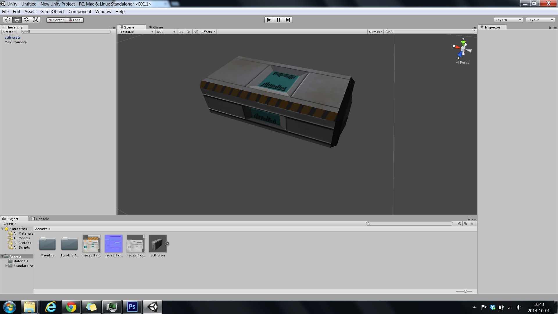
The color scheme that I chose for the crate is a very classic sci-fi theme which uses a combination of grey-shaded white with a clear finish, matted grey elements and splashes of orange details. I then chose to add the turquois displays because they corresponded so well with the orange details. The reason why I chose this scheme is that it is very straight forward and well established as a sci-fi style, making it easier to associate to in the way that I had intended, which is general sci-fi.
The dominant color on the crate in terms of surface spread is white, and the reason for that is that white is associated with clean futuristic technology beyond the perceived dirt and filth of aging and poverty, as mentioned in previous posts. I then added a bit of dust texture to give off an impression of wear and tear on the crate, to make it seem as though it’s been to different places and worlds where it was utilized.
The orange color has at least for me a meaning of industrial authority, so it lends an official air to the object. This could be due to association with government issued warning signs and overall signs of authority telling you what to do. I also connect the color with big constructions and project like for example a space program.
The elements of orange and turquois are highly saturated to make them stand out more against the low saturated white and grey. I made it so because that makes it easier to guide the viewer’s eye to the details and make them more “loaded” against the rest. This effect is further enhanced by the clash between the warm and cold colors of those same elements. I really like the effect that small details of warm colors can have on a motive where the dominant color scheme is cold and sterile. The implication that the color carries with it is so heavily amplified in that environment, that it makes for quite an effective tool in creating narrative through symbols. One example of that is the companion cube in the game Portal.


