Desolation: The Old World

So I have now for a while been working with concept art and creative development for the game Desolation: The Old World. Since it has been a while since I posted anything here on my blog I’m drop this bomb of my compiled work on the game!


This character was supposed to be a sort of merchant that would appear from any odd dark corner and trade with the player. scavenger_rat

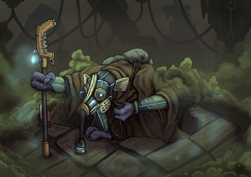
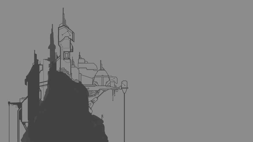
Here is a concept art of the enemy faction called “the Gnaarg”the gnaarg king
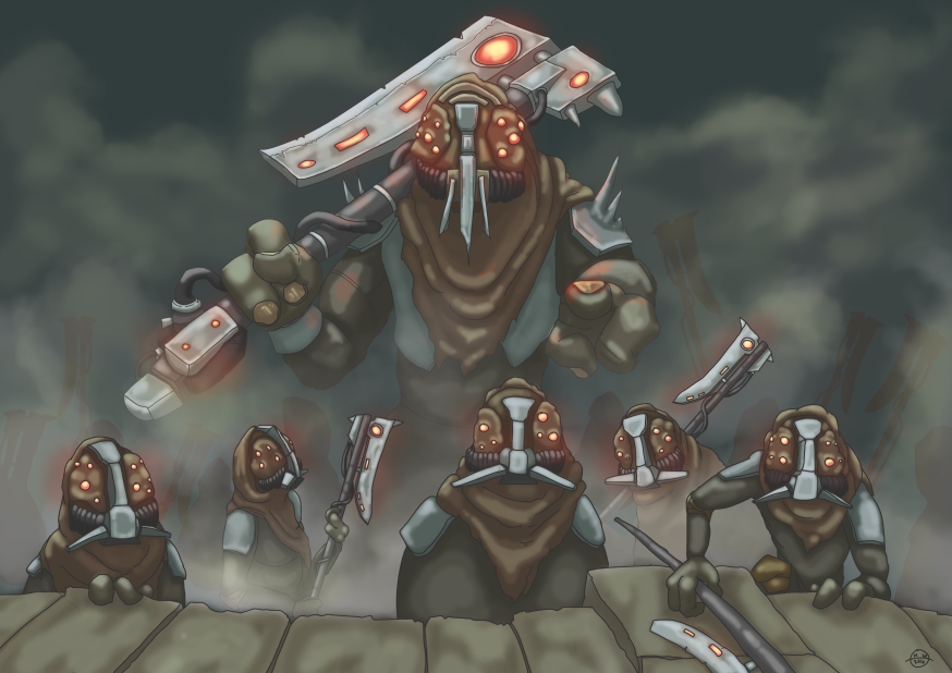
This is the fist rendered piece of an environment in the game, just to get a feel for what the game world should entail. It was decided to be a bit too bright. miljö concept

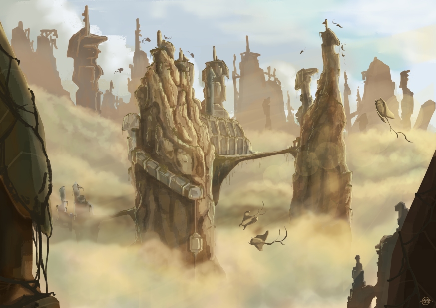
3D friendly concepts for the average door in the game. Iteration 3 was decided to fit the game aesthetic most. doorconcepts

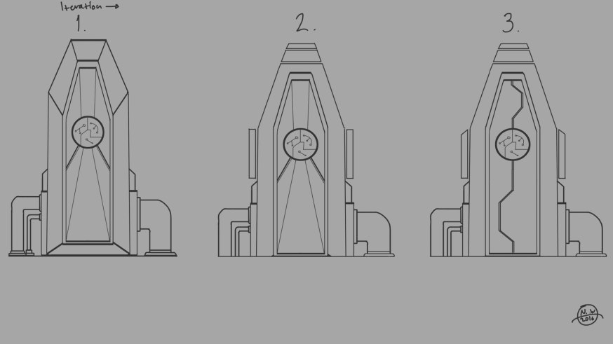
Some concepts for structures and architecture. asset_concepts_pt2miljökoncept 2 wip

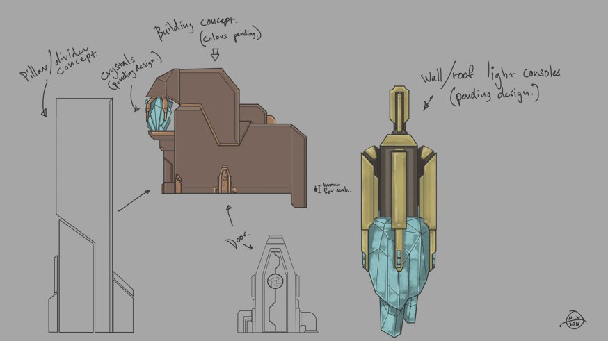
I wanted to try out some more stylized concepts for the game world as well.  miljökoncept2_stiliserat_new

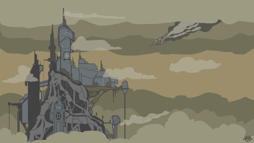
After a long process of traditional sketching I landed upon the design to the far left, I then proceeded to iterate in photoshop until I reached the design on the far right. In the end the visor was made more smooth some of the helmet diods were scrapped. mainchara_helmetconcept

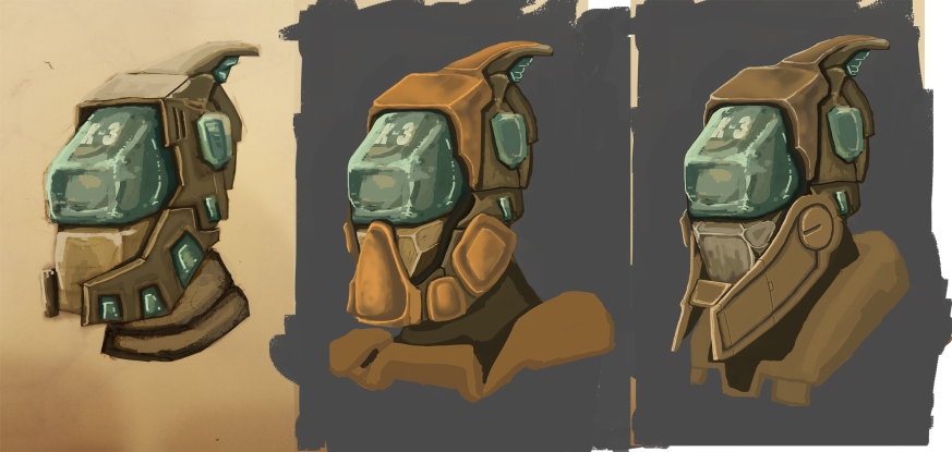
For the main character I wanted to give the team a few variations to choose from after the initial concepts were given green light. So I played around a bit with the proportions and silhouette of the character.   main-chara-TR-2

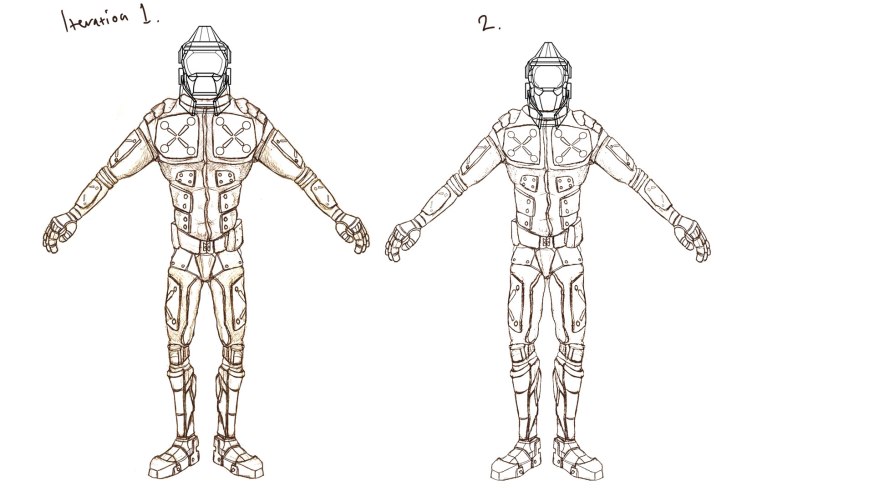
In the end the character landed on a more slender and realistic version that I cleaned up a bit and added some asymmetry to make it more interesting. main chara TR final

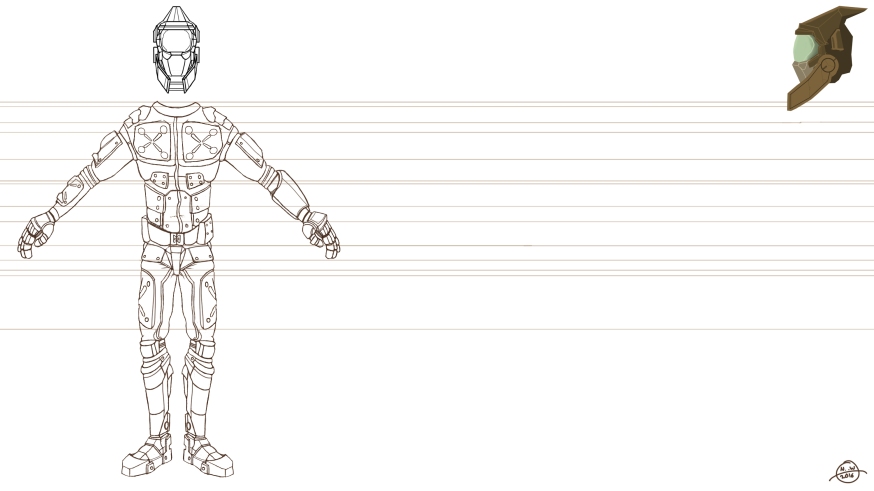
Here is the final piece I did for the game before it was put on ice. My requiem for the game! Desolation with logo

Apart from what I have shown here I have a mountain of sketches done by traditional means that lies dormant in my sketch pads:) All in all it has been really fun to work with the setting of the game and to get the opportunity to really poor my creativity in to creature designs and environment concepts! too bad the game could not go on.

Game Design In Practice

This term I’m doing a course in practical game design! for this course we are going to develop a game, or to be more correct in line with the teachings of the course, a product. This product is then for a passing grade supposed to be released to a guaranteed audience. During development the team needs to use their target audience feedback and needs in order to shape a product that fits their needs and market it according to that demographic.

My individual goals for the course are as follows: 

The three study goals I would set up for myself in order to get where I want to go with the course are; Post a minimum of one blogpost describing my workflow each work day both for the sake of communicating the development and to create a way for myself to trace my own progress. Follow up and take the time to evaluate all feedback that I get from the target audience, in order to capitalize on a working communication. And finally I need to work out a better structure to handle my individual tasks each week. Perhaps take every Sunday night to plan ahead for the week’s activities. That way I can manage the stress of both individual assignments and the work on the project.

To enhance my skill set when it comes to game development I need to learn how to structure the pipeline into many different stages of completion, mainly graphically speaking in my case. Using that structure would provide multiple opportunities for the team to present the concept to an audience. That way the graphical direction of the game can be established and iterated based on concrete input from the end users.

I think that a combination of using structural tools like lean and scrum and evaluating the product through terms of MDA and AARRR will facilitate the goals that I want to achieve during the course. I would like to solidify my understanding of these tools as well.

Perhaps my foremost goal of this course is to be a part of a development that releases a complete game or product to a audience that is not the people going to Gotland Game Conferens and to have that on my resume.

Big Game project! So far so good.

The three characters I have created so far in action poses.

The three characters I have created so far in action poses.

Introduction

During the later half of this semester we are taking the course of “big game project” in which we, the students get to create a game on a larger scale than the previous projects. Only this time with more experience and less production time… I work in a group of four people, two programmers and two artists. The game we are making is called “Glade” and it is a dungeon crawler that takes place in a nordic folklore inspired setting. The main feature of the game is that  the player will be able to play as all characters in this world, “If you can best it you can play it” is our catchphrase for the gameplay. So you would start out playing one character and then unlocking new ones by defeating different bosses or leaders of the different types of creatures.

The temp-level and the base mesh character.

The temp-level and the base mesh character.

The Team

The first week was focused a lot towards getting everyone on the team up to speed on the game concept, André Åström and I were on the same team while he was constructing the concept in the first place. I had already started working out some of the graphical aspects by creating a basic temp-level and a base mesh character just to get a better perspective on the artistic scope of the project. Based on the time it took to create those assets I drew the conclusion that we could complete this project with just one artist. However I also realized that having two artists would be crucial if there should be any time over for polishing the assets produced. The weekend before easter the course administrators held a whole day of presentations for the different concepts that the class had produced. This was held so that the concepts could receive feedback on the design, and also to recruit team members to join up and make the games. André and I had already teamed up, but we still needed one more of both programmers and artists, and so few days after the pitch we were able to recruit artist Max Nordlund and programmer Georgios Chatzoglakis. Once they were on board with the concept and the task we had ahead of us we could start producing assets for the game.

Production

The character collage at the beginning of the post just about sums up my work on the project the last two weeks. All three characters are almost complete with all their animations. In the beginning there was a lot of iterations I had to do in order to get it right, just figuring out how to structure a suitable pipeline for producing 3D characters with rigging and skinning and then directly have them implemented in blueprinted animation trees where a number of flaws were visible right away. For example I had assumed that Unreal would have a neat way of tweaning between a fully extended attack pose back to an idle pose, however I then realized that the interpolation between those points does not make a very appealing transition. This was something that was discovered in the first imported animation however, so the time loss could be minimized by dealing with the issue in the animations I made after that discovery.

I estimated that the task that would prove to be most time consuming for the artists would be animating the many characters we need for the game core features to be appealing, This estimation was based on both the previous courses work with animations and feedback received from the experienced staff of the university. To deal with this potential time-sink we structured the character development into a set of feasible milestones for the scope of the project. We determined that what we would need for the games core features to work, those consisting of different playable characters and an appealing combat system, we would need a minimum of four characters with their own unique animations for the presentation of the game during the Gotland Game Conference.

Based on this goal we decided that we would start by creating the four characters with the basic animation set of Idle, Walk, Basic attack, Get hit and death. Along with one character which would have a higher priority on being complete with all additional attacks for the programmers to work with in the engine. Once those milestones were reached we would go on to complete the remaining animations for the last three characters. At this point of the production we are almost at the step of completing all four characters and implementing them in-engine.

The project

It has been a while since my last post! Working on the first drafts for all the animations and map objects takes up most of my time right now. The focus for us artists on the project has been to create as much placeholder graphic as possible to fill out the alpha version of the game, these placeholders then works as the foundation for the final product. 

The best thing about working with first and second drafts and placeholder graphics, is in my opinion that it allows for a more accurate visualization of what the final stage of the graphics should look like. It also gives the artists more flexibility and room for late changes if adjustment to the game’s aesthetics would occur. The praxis for this project is to take ideas from brainstorming into many stages of sketching before making placeholders and then finally the refined end result.


Concept sketch of on of the four characters.

Image


One of the many drafts towards the placeholder for the “defender” character.

Image


The first step of working on the final draft for the character.


Image

 Much of the graphic has changed in order to improve the overall clarity of the gameplay, for example we changed the body into a crystal to ease the transition into colorizing the body as well as the mask, this was done so that the player would more easily identify his/her character during the gameplay.

More updates will come as soon as I have time! thank’s for reading!  

The conclusions drawn from the project in retrospect

The main conclusion derived from analyzing this project is that a game productions most instrumental asset is communication. For this project, the key to a working communication was a combination of the structure provided by the use of the MDA perspective on game development, which gave the group a common language and frame of reference when discussing every design based decision of the game. And the organizational focus that came from the use of the scrum model for planning and executing the production. These two methods put together with communication software like Skype and file transfer software like Dropbox were the foundation that made the final product possible.

 Another conclusion is that as a team starts working on a game project, it is crucial that they address problems within the group as early as possible, before the problems are given room to create unnecessary harm to the productivity of the group.

One thing that could have been done better is prototyping and brainstorming in the beginning of the project, the group was a bit too hasty when going in to production. The problem that this caused is that many design decisions were made after the production was in motion, leading to wasted work hours spent on features that were later removed. 

Working on “Aggressive Bystander” was a great experience for me, I have learned a lot about producing 2D-graphics for games and evolved as an artist. 

Week 9

Now the final stretch is getting closer! The work I do now mostly contain of polishing the animations that we already have and adding smaller feedback effects, but there are always unexpected problems that need fixing! For this week’s blog post I have chosen to write about the work I have done on the game space.

Working on the game space has been an on and off process during most of this project, there has been a lot of iterations and changes in formats and color scheme and style. You can see the older variations in some of my previous posts, here I am going to show you the final version.

For a long time now, the idea was to split the houses and street into different sprites, and in that way we could vary the order in which they should appear. This would also save a lot of performance strain in the game since it does not have to load full HD images all at once. However when the coders implemented that version, there were some major screen tearing and glitches that they could not figure out. So I went back to the previous format, where each image is stacked on the other, this gives less room for further iterations, but it saves us time.

In the new iterations I wanted to add more details to make the surroundings more interesting to look at, but at same time I wanted to refrain from distracting the player from the action. With that in mind I chose mostly harmonious colors that would not pop out too much in the peripheral vision of the player, and if they do, they should consist of objects that are easily recognizable and identified.

My biggest grief is that there was no room for me to really go nuts with the background and give it more life. The coders time frame would not allow for any animations in the background, and the coders word is the law in this case. My vision was to add pillars of smoke and fires from Molotov’s and barricades filled with protesters and police fighting, and all of it fully animated.

I’m still pleased with the end result as it is, I think that the variations are enough to keep the player from getting bored with the surroundings. Oh, I almost forgot! I added solar panels to one of the new houses! I thought that since they have those in the kinder garden game, it could become this year’s gimmick! And at the same time promote clean energy! Boom! Serious games…

Thank you for reading! Good luck to all!

Image

Week 8

This week I have among other things been restructuring the HUD, or head-up display. We chose to place the pumpmeter (which can be seen in previous posts) at the bottom of the screen instead of having it in the top left corner. This in turn called for some changes to the HUD as a whole, so after a few different drafts it came down to the designs that I will present in this post.

Our HUD consists of the pumpmeter, a score counter and a frame that indicates the types and number of power ups the player has collected. In the game, the player collects a power up by smashing open trashcans positioned on the sidewalks. An unexpected problem with this design presented itself during last week’s play testing, the people who tested the game found that there was no visible indication or feedback that made it clear that you should hit the trashcans for power ups!

Image

So in response to that feedback I decided to incorporate a hint to the smashing of trash in to the design of the power up holder, in this way I am hoping that I will have hinted enough with as few means as possible and spared the game from having text indications popping up all over the screen.

I wanted the art-style in the power up holder to feel unison with the style of the rest of the game, so I used elements and shapes from other designs in the game. For example I used the “pow” explosion that appears when the player punches an enemy, as a frame behind the power up holder. The circles that hold the power up icons I drew from the shapes of the pumpmeter, and the text has the same style as the “alert effects” on the pumpmeter as well. A thing that I have had in mind throughout all the art in the game is to frequently use the same thickness in the lines in areas that are connected, so to give a balanced impression.  

When choosing the color scheme for the holder, my main concern was that it should stand out from the background, but at the same time it should not compete too much for the eyes attention with the pumpmeter. So I went for a cool cyan color, complemented with a warm orange, I then put in a highlight in the explosion to make it stand out from the background a bit more. I used the same shapes and colors for the score holder, so to not create dissonance in the visual impression of the HUD.

Image

Here is the new version of the pumpmeter, so you can get some understanding of the design.

Image